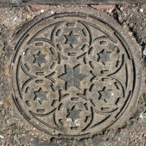
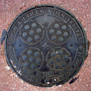
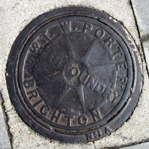
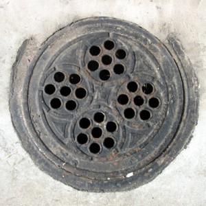
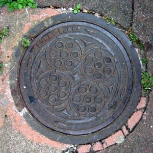
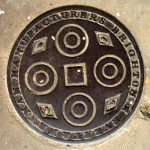
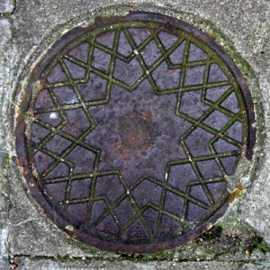
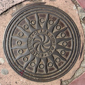
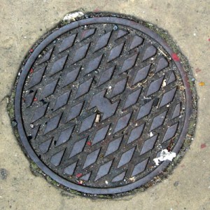
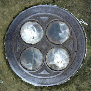
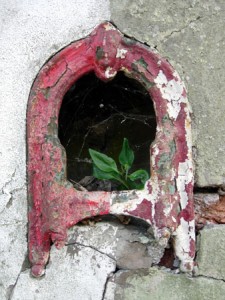
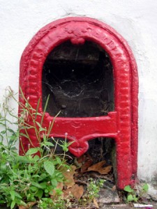
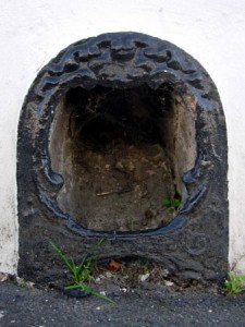
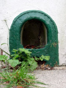
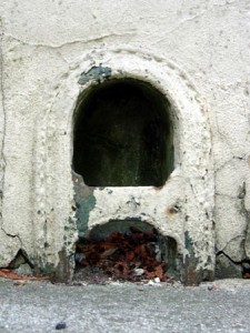
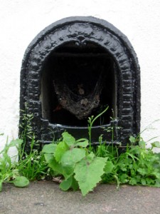
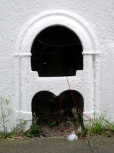
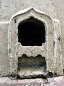
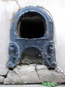
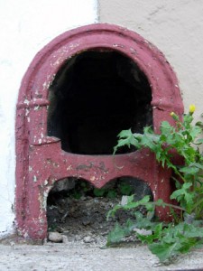
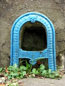
In the 19th century many town houses were built with a coal cellar under the pavement in front of the house. Coal hole covers are the cast iron plates that cover the entrances to these cellars. Although no longer in use, many still exist and there are some beautiful designs. Here are some examples I have found around Brighton.
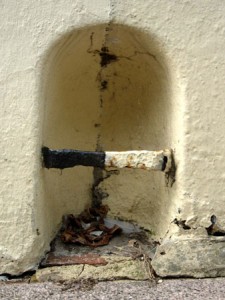
Boot scrapers of Brighton
Wild swimming
 As a teenager in the 70’s I went swimming three or four times a week in Stevenage Swimming Pool. In those days health and safety was not taken too seriously, so we had a 6ft springboard, running jumps from a 12ft top board and could play all kinds of games such at jostling to retrieve a pair of goggles placed at the bottom of the 12ft deep-end. Sometimes, late in the day when the mums and dads had left, we had mass games of ‘he’ in which even the lifeguards joined in. Racing up to the top board to run and jump out as far as you could with someone in hot pursuit was a fun tactic in that game.
I guess it taught me to be confident in the water, but these days I never swim in an indoor pool. After leaving Stevenage I rejected chlorinated captivity and started to swim in the wild, in lakes, rivers and the sea.
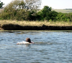
I’m a bit of a wimp when it comes to cold water, so most of my memorable swims have been in the tropics. Now, reading Roger Deakin has inspired me to do more wild swimming in England. This photograph is from a swim in the Cuckmere in Sussex a few days ago.
Rounded corners, tidy code
This technique is no longer needed – we have HTML5 and CSS3 and support for border-radius now.
There are many techniques for putting rounded corners on a box. All of them require some deviation from the ideal of clean, semantic (X)HTML for structure, CSS for presentation and scripting for behaviour.
The technique of placing corner images directly in a page goes against the idea that CSS should be used for presentation and reduces flexibility (no style-switching). Techniques that use JavaScript seem like overkill to me, and the resulting page code is often the same anyway.
Best let CSS handle it. The cleanest and most concise way I have found uses four <div> elements to call the corner images from a stylesheet.
The code for the page.
<div id="container">

<div class="nw"><!-- --><div class="ne"><!-- --></div></div>

<p>Content</p>

<div class="sw"><!-- --><div class="se"><!-- --></div></div>

</div>
The code for the stylesheet.
.nw, .ne, .sw, .se { height: 15px; }

.nw { background: url(nw.gif) no-repeat top left; }

.ne { background: url(ne.gif) no-repeat top right; }

.sw { background: url(sw.gif) no-repeat bottom left; }

.se { background: url(se.gif) no-repeat bottom right; }
Pretty straightforward. Using empty <div> elements for presentation like this looks a bit messy but I do not think it is incorrect. The comments are added because some browsers will add default dimensions to an empty <div>. The <div> elements are nested so that there is no need to declare a width on the classes.
CSV 10-week web design course
I will be delivering a 10-week web design course at the CSV Media Clubhouse in Brighton starting February 28th. The course costs £200 and will run on Wednesday evenings from 6pm to 9pm.
It is an opportunity to design, build and publish your own website and places are still available. The course will focus on creating a clean, standards-compliant site using stylesheets for presentation. A blog or simple e-commerce facility may be included as part of your site if you wish.
We will be working mainly in Dreamweaver and Photoshop. No previous experience of these programs is necessary, but you should already have reasonable IT skills to get the most out of the course.
Contact Erin or Alex at CSV on 01273-720894 or at brightonclub@csv.org.uk for more information.
Laceyleague predictions
Putting the Laceyleague predictions for the new season into the spreadsheet I use to calculate the points I couldn’t resist a little analysis. Taking the average predicted positions (in brackets) of the 18 entries gives the following table.
1 Chelsea (1.22)
2 Liverpool (2.39)
3 Manchester United (3.22)
4 Arsenal (3.61)
5 Tottenham Hotspur (5.39)
6 West Ham United (7.94)
7 Newcastle United (8.00)
8 Everton (8.33)
9 Blackburn Rovers (8.39)
10 Bolton Wanderers (9.50)
11 Aston Villa (11.78)
12 Middlesborough (12.67)
13 Charlton Athletic (13.67)
14 Portsmouth (13.72)
15 Wigan Athletic (14.11)
16 Manchester City (14.22)
17 Fulham (16.06)
18 Reading (18.50)
19 Sheffield United (18.56)
20 Watford (18.72)
Interesting. There must be a lot of optimistic West Ham supporters among the entries!
Labyrinths are unicursal
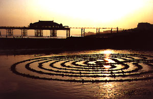 A labyrinth is a unicursal path – a single path with no forks, no junctions, no crossroads. It’s what makes it a labyrinth and not a maze. A maze is a series of choices, a puzzle to be solved. A labyrinth is a journey, the only choice to be made is walk or don’t walk.
I make them and walk them as a meditation. Here is a photograph of one I made on the beach in Brighton, on the sand exposed during a particularly low tide. An hour or so after it was completed the incoming tide claimed it.

